The Current Flow
Users usually entered the Premium flow through push notifications, emailers or marketing campaigns, not through the app
There was one main entry point through an animated FAB on the Niyo Homepage.
The conversion rate for users who reached the Premium page was very low- hovering around 0.8%


The Premium page on Niyo's website gave an overview of the membership and its benefits to all users - Niyo and non-Niyo.
Identified Problems
A combination of heatmaps, user calling, user testing and research brought out some glaring issues in Premium.
1
Where to find Premium?
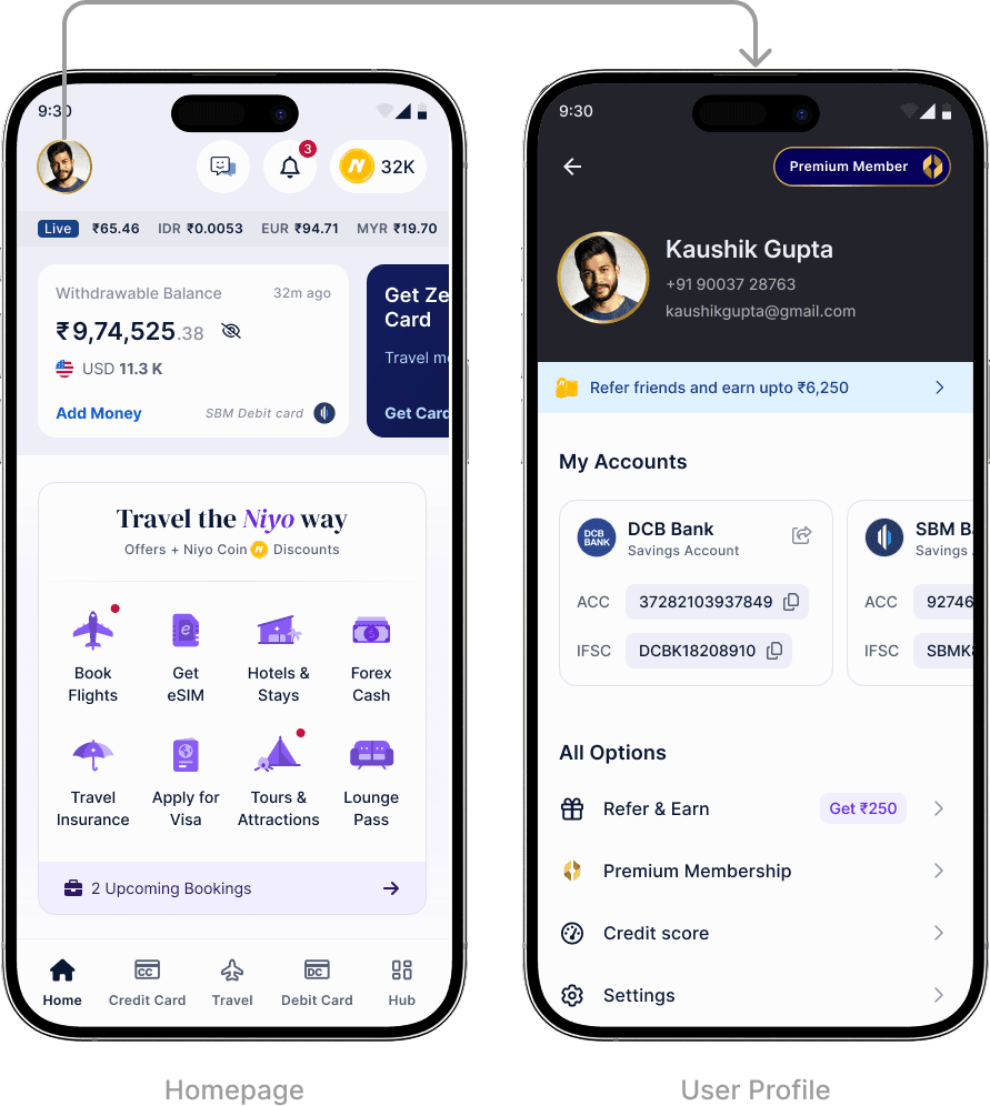
There was no clear entry point to Premium on the homepage. Casual users browsing the app were unlikely to find out about Premium outside of marketing campaigns and PNs/emailers.
2
No grouping of information
Related information was scattered throughout the page. For example, information on how many lounge passes the user had, how to claim the lounge passes and FAQs were in three different places.
3
Active Premium users had no visual cues to the status of their membership.
The only indicator of their active membership on the homepage was a thin gold border on the profile picture, which led to the expanded profile with a Premium ingress on top.
Places where Premium benefits came into play, like the whopping 10% discount on hotels - appeared as a simple line item on the checkout page.

4
Misconceptions and lack of understanding of benefits
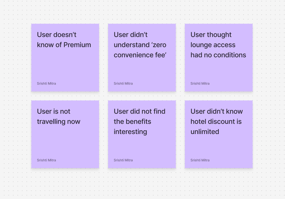
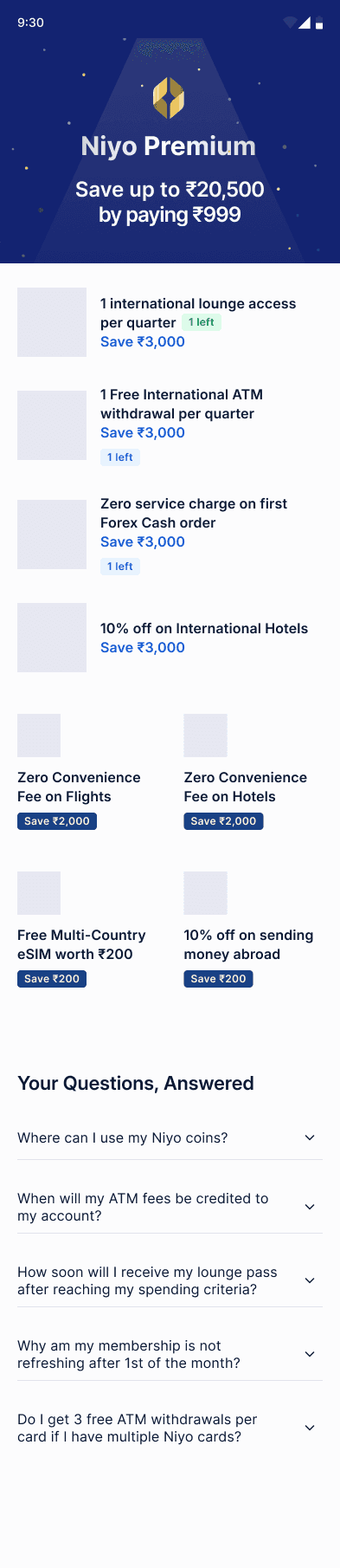
During user calling of people who dropped of from buying Premium, a common refrain was that the benefits were very complicated. Further probing showed that users did not understand many of the benefits. (Eg: What is zero convenience fee on flights and why do I need it?
However, when users were explained the benefits on call or by a Niyo agent, the conversion rate shot up to roughly 30%.

5
Inconsistent UI
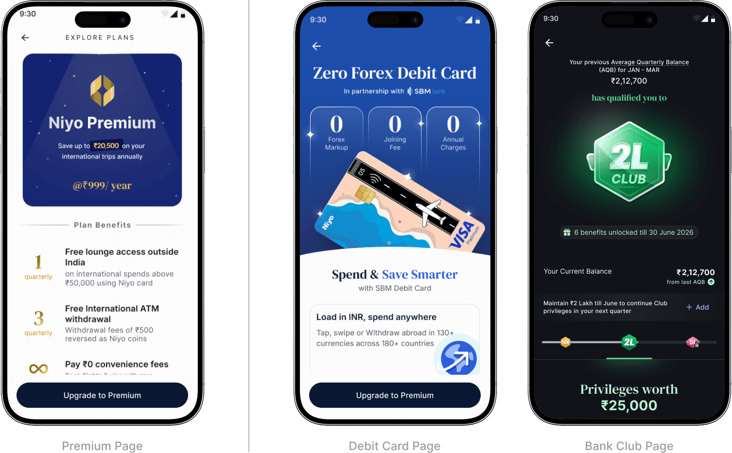
The Premium page looked quiet different for active vs inactive users. Additionally, during user testing, almost every participant attempted to tap on the benefits in the 'Active' screen, but the cards weren't actually tappable.
6
From heatmaps & session recordings
A deep dive of the website heatmaps showed many empty clicks on the benefits tiles, with most of the clicks being concentrated on the 'Free lounge' and 'Flights and hotel discounts'.
The order in which the tiles were tapped gave a rough estimate of which benefits users were gravitating towards.

A vibe-coded 'Savings calculator' had been introduced to the Premium website at some point. The button to 'Calculate Savings' was the second most tapped element on the page.
Upon reaching the calculator page, users were not interacting with any of the items on the page. They were tapping around and exiting after a few clicks.

7
Dull logo & Branding
The colours of Premium looked flat and desaturated compared to the rest of the app, especially for a plan hinging on luxury and aspirations.

8
Scalability for the future
Niyo wanted to experiment with additional plans in the future, and be able to change the benefits and pricing of the plans to see what resonates better with users.

Research
Before wireframing, I decided to confirm some of my hypotheses with Niyo users. I also looked through research papers and other membership screens.
1
Speaking to the Users
Niyo conducts regular community meetups, where power users of Niyo come together to share their travelling experiences with each other, and know about exciting features that are in the works for the app. I attended one such meeting to figure out what users thought about Niyo Premium.
Most of the users had no knowledge of Premium or had only come across it while browsing social media ads or their emails, thus validating the user calling done earlier.


I presented Premium benefits to the users and asked them to vote for the ones they were interested in. The answers put users into two groups according to age, who had different priorities.
18-35 year olds
Responsible for 45% of Niyo's spends
They tend to visit cheaper countries like Thailand, Malaysia. They are quite interested in lounge and forex cash, because they don't have any other credit cards with lounge access, and the countries they visit tend to be cash-focused.
35-50 year olds
Responsible for 30% of Niyo's spends
They were not interested in lounge access, as they had other cards with this benefit. However they really liked the hotel and flight discounts.

2
Scientific Research on Subscription Psychology
Since there is a wide body of research on subscription models already, I combed through a few research papers for best practices when it comes to designing such plans.
Users regard subscription models as a signifier of greater legitimacy for a business.
Subscription models need periodic reminders of their effectiveness and benefits to the users.
Customers are more satisfied with the experience when there is full transparency about the terms and conditions.
Automatic renewal makes users more likely to continue with their subscription.
3
Analysing other Membership Screens
I sampled membership screens from some of the best apps in the business (thanks Mobbin), and combed through them for any trends or structures that I could incorporate into my design.

Creating the Screens
I started systematically tackling the problems I had identified, starting with visual language and moving on to wireframing and flows.
The Visuals
Since Premium already had a substantial user base, I refreshed the logo and colour palette while keeping the essentials the same. The new logo looks more luxurious and lustrous, standing out against regular UI.

The Main Screen
Based on research, I knew the page had to incorporate some key points:
A flashy hero section with Premium branding and talking about total savings
A list of benefits, with the ability to highlight some and deprioritise some.
A calculator and a breakdown for the user's savings
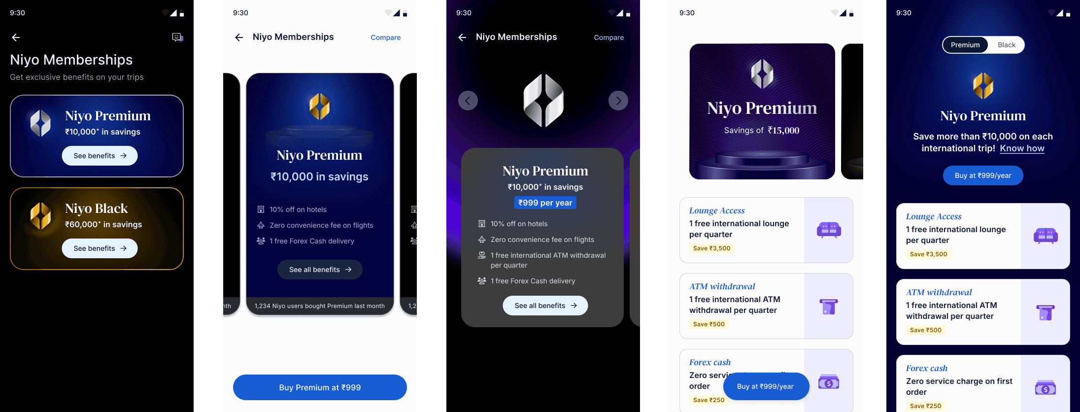
Here are a few explorations from my journey through the evolving wireframes:


Designing for Multiple Memberships
I immediately started working on the look and feel of Niyo Black. The challenge was to make it look like a step up from Premium, which was already meant to look luxurious.
There would also have to be a way for the to browse all plans and swap between them with ease.



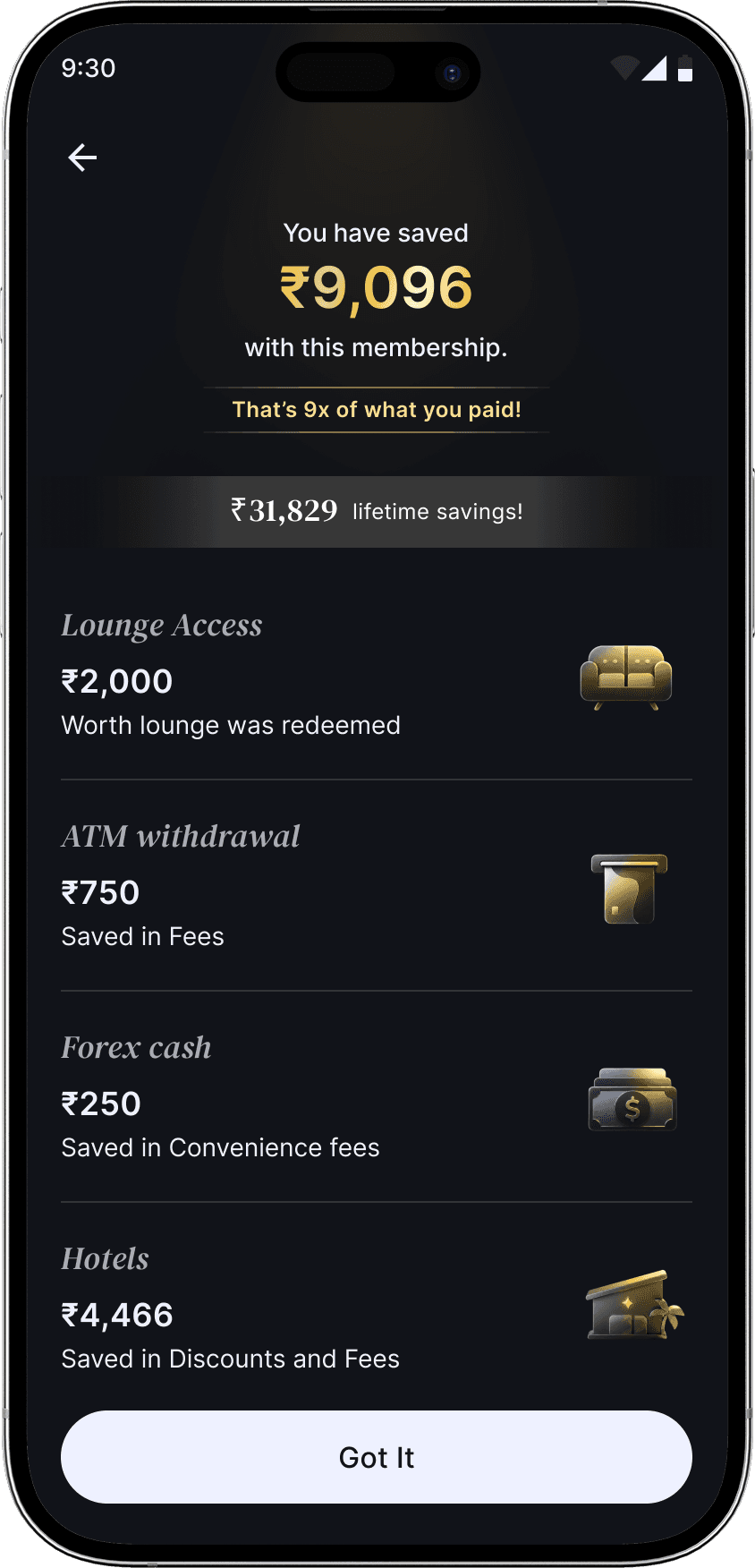
Showing cumulative savings
A new API was made to track the user's actual savings with the membership plan. I had to find a way to surface this to the user.
After weeks of experimentation, rounds of stakeholder reviews and incorporating feedback, I converged down to the outcome.
The Final Product
The new design has multiple memberships, improved visuals and touchpoints, full transparency about benefits and their terms, as well as savings tracking.


The user can find memberships where they really matter.

Before buying Premium, users can find entry points describing membership perks in the travel related sections.
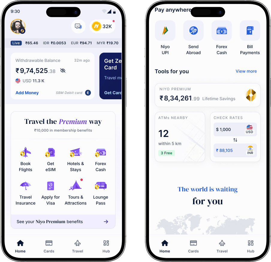
After purchase, all travel products that have attached membership benefits are highlighted. Users' savings are also surfaced on the homepage.

For non-paid users on the Travel products page, an entry to memberships has been added to the top. There is bigger card about memberships at the bottom.

After buying a membership, the title of the page changes. Travel cards get banners with discounts on them and the bigger membership card talks about the expiry date.


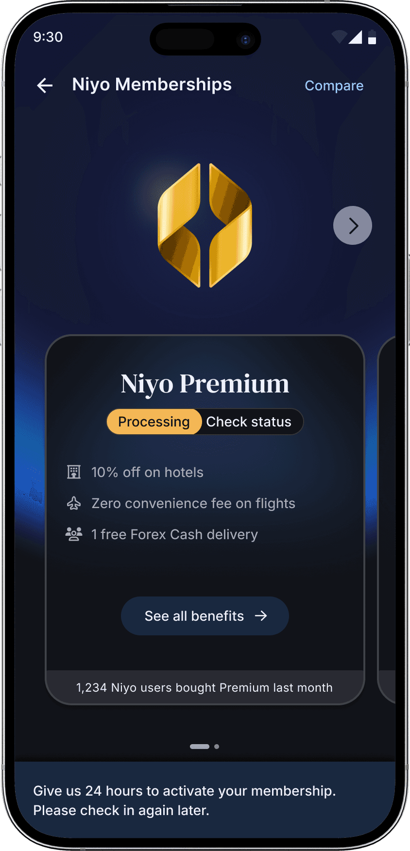
The membership screen shows users quick value and differentiators.
This allows for easy comparison and navigation.
The expanded screen highlights benefits in detail and is highly modular.


The benefits come in large and small sizes, so that they can be highlighted with a switch.
They can be added, removed and reordered in the grid without changing the look of the page.
This means users can now be targeted with the benefits that would appeal the most to their group.

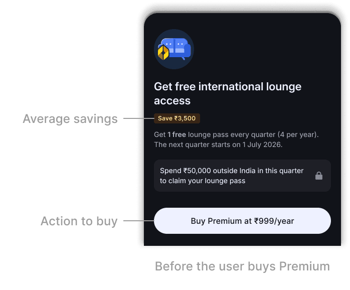
All information about benefits available in one tap
Using the current users' tendency to tap on benefit tiles, we can group all relevant information like number of uses, expiry dates and terms here. The CTA on these bottom sheets leads users directly to the flow to use that benefit.


A savings calculator for interactive calculation
The best way to show users the value in memberships is to demonstrate how much they will actually save with their usage.
Playing around with the calculator and its sliders/steppers reinforces how users can make their money back (and more) in a single trip.
Showing the user's cumulative savings gives tangible evidence of the plan's value.


Handling states, tie ins and complications from other Niyo features
What happens if the user has two memberships at once? What if the user got a free membership as a reward? What if the user wanted to upgrade their plan, or extend it? I had to design for every single eventuality.


What's next?
The visuals have not been completely finalised. A revamp of the website is pending, as well as implementation of the complete designs.
Once enough data is collected about the partial implementation, I can continue refining the membership flows further.